Articles
What We Brought Back from Coverings 2026 — and What It Means for Your Projects
Every year, our team walks the floor at Coverings, the largest tile and stone trade event in North America, and returns with a clear sense of where design is actually heading.
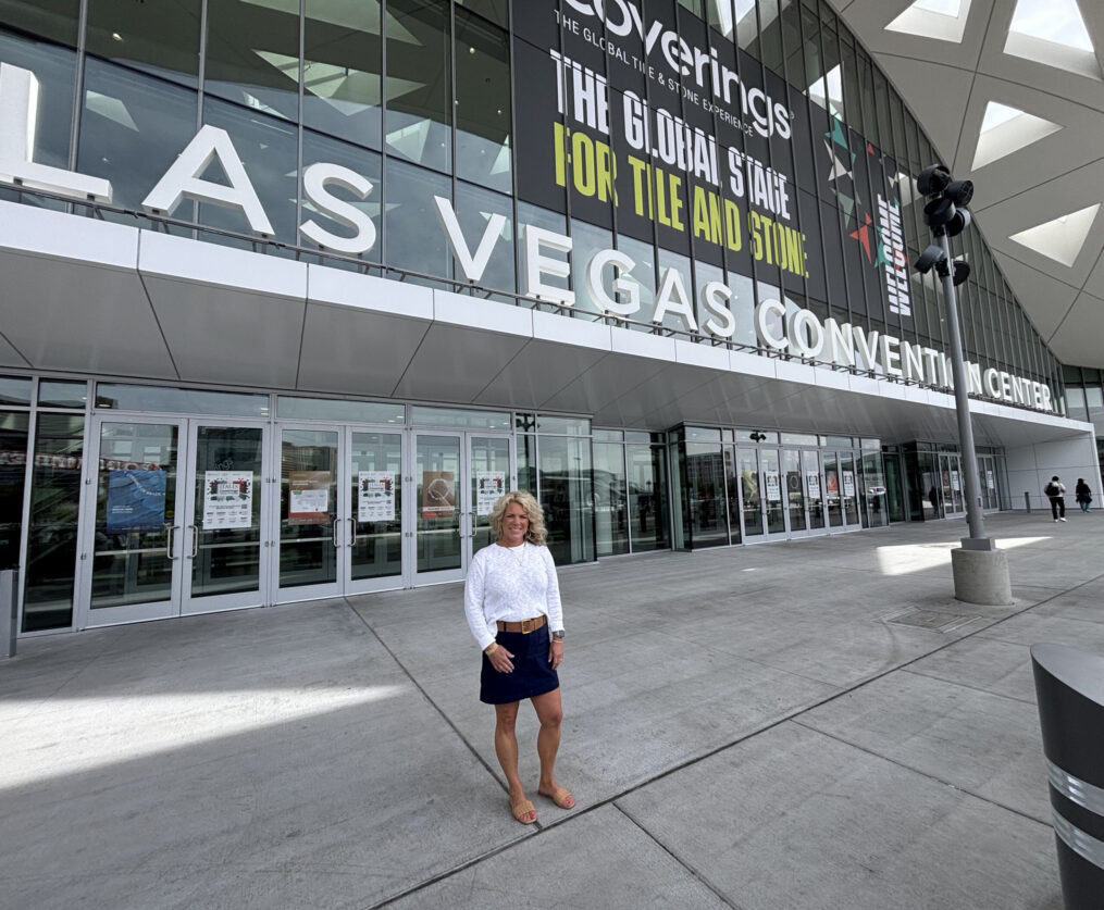
Every year, our team walks the floor at Coverings — the largest tile and stone trade event in North America — and returns to Ohio with a clear picture of where design is heading. Not just what’s new, but what’s gaining real traction. What’s crossing from specialty request into mainstream specification language. What’s changing the way designers are thinking about surfaces?
This year, we took it a step further. Trend Night 2026 brought those ideas directly to our Columbus and Cincinnati showrooms: the surfaces, the expertise, and the conversation, all in front of the designers and architects shaping projects right here in Ohio.
The rooms were full. The conversations were genuine. And a few themes came through so consistently, from the show floor in Las Vegas to the showroom floors back home, that we’re confident calling them movements, not moments.
Burgundy Is Here. It’s Not Leaving.
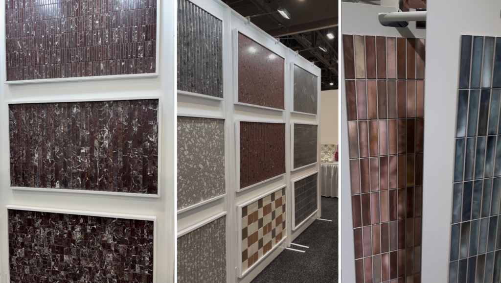
When our team returned from Coverings 2026 and said burgundy was the dominant color story on the floor, we expected some skepticism. Bold color proclamations come and go. But this one is different — and the reaction at Trend Night proved it.
In both Columbus and Cincinnati, the conversation around deep wine tones, burgundy glazes, and rich crimson surfaces was immediate and enthusiastic. Designers who’ve been sitting on the idea of committing to color are now ready to have that conversation.
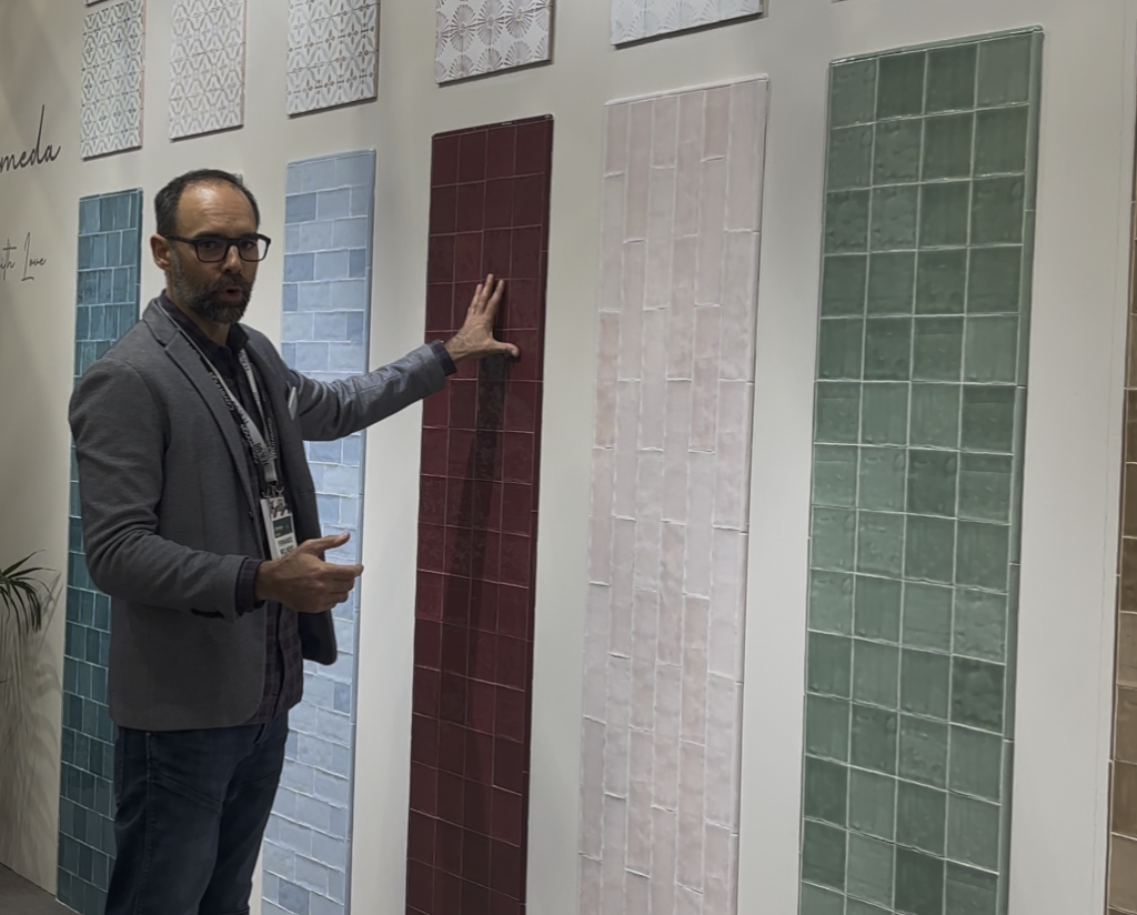
What separates this moment from previous color trend cycles is application. Burgundy at Coverings 2026 wasn’t being used as an accent tile against a white field. It was the whole room — full kitchen backsplashes, floor-to-ceiling feature walls, built-in seating entirely clad in deep, glossy wine tones. The statement was total.
“Burgundy wasn’t one of ten colors in the room. It was the color that made people stop walking at Coverings — and the color that came up most in conversation at Trend Night.”
From a specification standpoint, burgundy is more forgiving than you might expect. It integrates naturally with warm woods, aged brass hardware, honed natural stone, and warm white plaster — without competing for attention. It anchors a palette rather than overwhelming it.
For clients who’ve been circling the idea of committing to color but haven’t gotten there, this is a meaningful moment to reopen that conversation.
The Zellige Aesthetic Has Crossed the Threshold
In both showrooms at Trend Night, one category of surface kept pulling people back throughout the evening. Not just looking — physically picking up, tilting in the light, running their fingers across. The zellige aesthetic: that luminous, handmade-feeling glaze where each tile reads slightly differently from its neighbor in color saturation, surface reflection, and depth.
This look has been building for years. At Coverings 2026, it crossed a threshold — from specialty request to mainstream specification language. Designers who’ve been asking for this look are now being asked for it by their clients. The market has caught up with a product that delivers on the surface quality without the supply unpredictability of traditional imported zellige.
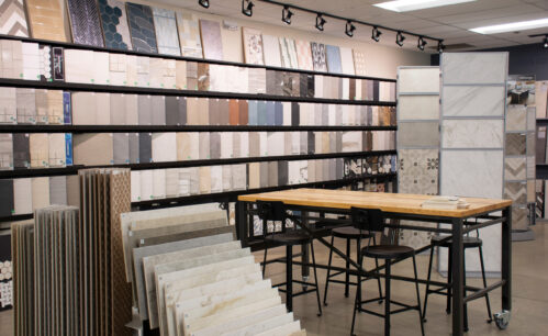
The single most useful thing you can communicate to a client about this aesthetic is what it does over time. A zellige-look installation is a living surface. It changes with the light throughout the day — morning reads differently from afternoon, which reads differently from evening. That behavior is impossible to communicate with a small sample chip. It only lands in a full installation or a large sample board.
Every designer at Trend Night who saw our larger displays understood it immediately. The ones working from small samples were still guessing.
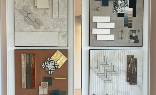
A note on color: burgundy and zellige-look glazes are a natural pairing, but this aesthetic travels beautifully across the spectrum. Sage green, slate blue, warm cream, terracotta — all of them benefit from the depth and variation the glaze provides. The aesthetic is the story; any colorway can carry it.
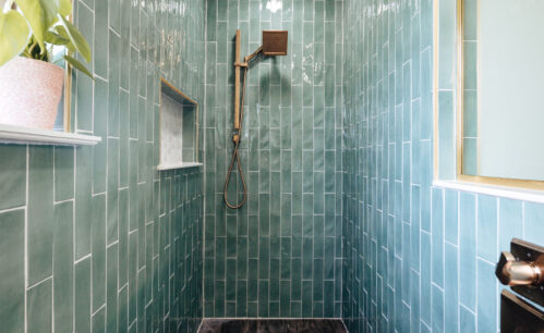
Linear Tile Is Giving Flat Walls a Reason to Exist
One of the clearest format stories at Coverings 2026 is the power of linear tile. Long, slender tiles used vertically, stacked, where the grout line becomes a deliberate design element rather than something to minimize or hide.
The result is architectural. A vertically stacked field of narrow tiles reads like fluted stone, ribbed plaster, or paneled millwork. It gives flat surfaces a sense of dimension, craft, and visual weight — without adding complexity to the installation process. For projects where the architecture is straightforward and the budget doesn’t allow for custom millwork or detailed finishes, linear tile is doing real design work at a fraction of the cost.
At Coverings, we saw this format used on curved surfaces in ways that were genuinely surprising — wrapping columns, following arched niches, cladding curved kitchen islands. The narrow format accommodates curves that larger tiles simply can’t, and the resulting texture amplifies the curve rather than fighting it.
If you have a project with curved architectural elements, it’s worth a serious look.
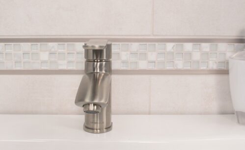
Edge Trim Is Back — and It Matters More Than Ever
This one caught some people at Trend Night off guard — in a good way.
Edge trim and liner tiles had a quiet decade. Large-format tile reduced exposed edges, minimalist aesthetics made floating installations the default, and trim became something to specify only when you had to. It quietly became an afterthought.
Something is shifting. As handmade surfaces, zellige-look glazes, and artisanal aesthetics become more prevalent in specifications, the way an installation terminates carries more weight. A raw cut tile, a generic metal strip, or a bullnose that doesn’t quite match the field glaze reads as exactly that — an afterthought — against a beautifully considered wall surface—discerning clients notice.
A coordinating liner or bullnose in the same glaze family completes the installation. It tells anyone who looks closely that the design was considered all the way to the edge — not just in the center of the wall. That level of finish is what separates a good tile project from a great one. And it’s a distinction that sophisticated clients increasingly recognize.
See It in Person
Our team is ready to walk through any of these trends in the context of your current projects. Come in and see the surfaces that had the room talking.